Beautiful Power Apps – The Series – Post 1
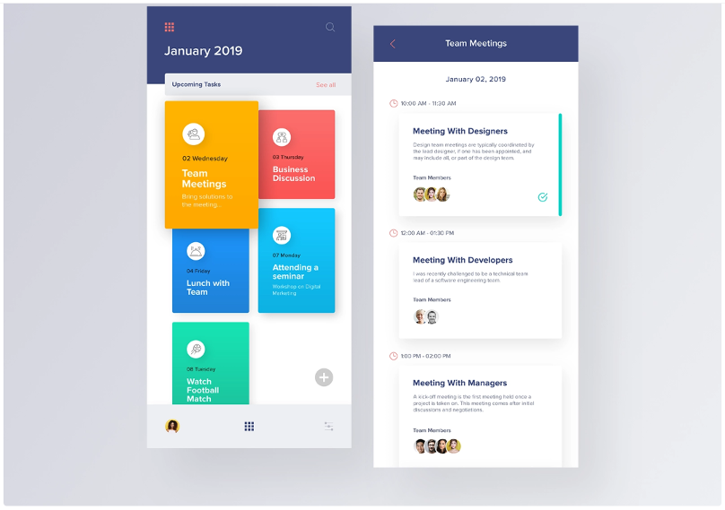
This blog is the first in a series of blogs in which we show how you can build beautiful apps in the Power Apps platform. The Power Platform is a no-cliffs platform and as specialist engineers on the Power Apps we can push it’s limits.
The Dribbble Challenge
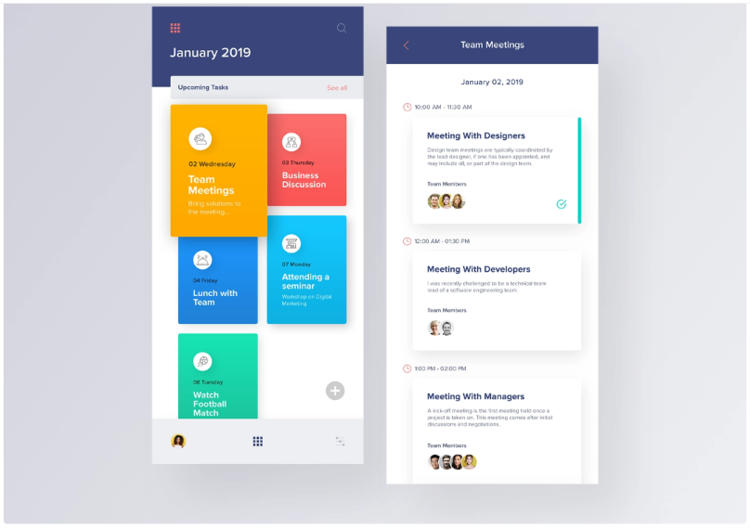
A Dribbble design, was tossed into the discussion and we all agreed to test the difficulty of making the same UI design in Power Apps. Do we need to use graphic images to get those gradient fills and drop shadows? Do we need to use more code through Power Apps Component Framework? We certainly can, but we would be adding dependency on external tools. Wouldn’t it be better to use out of the box features and test its limits? Less code, more power right?
Breaking it down
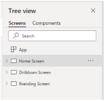
Let’s break down the things we need to do. So, what we have here looks like a Home screen and a Detail/Drilldown screen. We also want to implement a branding screen for app color palette and typography.
Screens to create
- Home screen
- Drilldown screen
- Branding screen
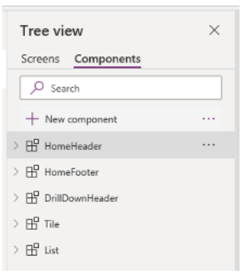
Let’s break it down further to reusable components. We don’t want to jump in right away and start dragging components here and there on the screen. We need to make the effort worthwhile by having components that we can reuse. We don’t want to be creating more screens in the future by copying basic components like labels and buttons, we want reusable components that can be used across the app. That way, we minimize the amount of effort required when we want to change something. So, looks like we need a header component for both the Home screen and the Drilldown screen. Let’s call them HomeHeader and DrilldownHeader. Then we need a footer component for the Home screen, let’s call this one HomeFooter. Then we need a tile component for the Home screen and a list component for the Drilldown screen, let’s call them Tile and List respectively.
Components to create
- HomeHeader
- HomeFooter
- DrillDownHeader
- Tile
- List
Creating the components
We start by creating the components.
HomeHeader Component

When creating the HomeHeader component, use a disabled button to get the rounded corner and make the component transparent.
To make the rounded corner, set the button border radius to 5.

To make the component transparent, set the fill property to RGBA(0, 0, 0, 0).
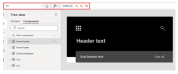
Next we create some custom properties so that we can customize the component when we use it
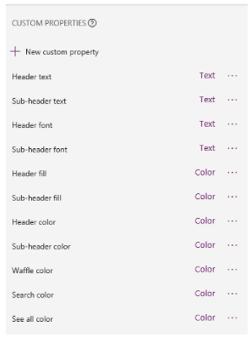
- Header text
- Sub-header text
- Header font
- Sub-header font
- Header fill
- Sub-header fill
- Header color
- Sub-header color
- Waffle color
- Search color
- See all color
All of these are of input property type. Please refer to the image below for the data type.

HomeFooter Component

Next, we create the HomeFooter component. We used the cog icon for now as it would be a good replacement to the settings icon of the original Dribbble UI.
We also create some custom properties so that we can customize the component when we use it
- Waffle color
- Footer fill
- Footer image
All of these are of input property type. Please refer to the image below for the data type.

Tile Component
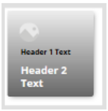
Next, we create the Tile component. To achieve the rounded corners, gradient fill, and drop shadow, we will use HtmlText. We will use a background-image of linear-gradient on our div to achieve the gradient fill effect. We will use box-shadow on our div to achieve the drop shadow effect. We can play around with the values for the drop shadow to get a more identical look, but let’s settle for our values now and do that when we are done. For the rounded corners, we will use border-radius for our div. Please note that we would be passing some custom properties to our HtmlText to control the width, height, gradient light color and gradient dark color.

Then, we overlay a transparent button above the HtmlText. We set the OnSelect property of the button to navigate to the screen passed to the ScreenToShow custom property of the tile that we will add.
![]()
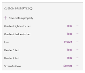
Again, we will also create some custom properties so that we can customize the component when we use it in our app
- Gradient light color hex
- Gradient dark color hex
- Icon
- Header 1 text
- Header 2 text
- ScreenToShow
All of these are of input property type. Please refer to the image below for the data type.
DrillDownHeader Component

For our DrillDownHeader Component, we will also create some custom properties so that we can customize the component when we use it in our app like the other previous components.
-
- Header text
li> Header font
- Header fill
- Header color
- Back color
All of these are of input property type. Please refer to the image below for the data type.

List Component
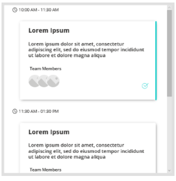
For our List component, we will be using a gallery. We will also use HtmlText for the card like item and use a disabled button for the round-ended vertical line.
Let’s also create some custom properties so that we can customize the component when we use it in our app like the other previous components.
- Data
- Clock icon color
- Schedule font
- Schedule color
- Title font
- Title color
- Description font
- Description color
All of these are of input property type. Please refer to the image below for the data type.

Alright, now that we have all the components, we will create the screens and use these components that we’ve created.
Creating the screens
Let’s create a branding screen first. Let’s start with header text and regular text for typography, and a four color palette.
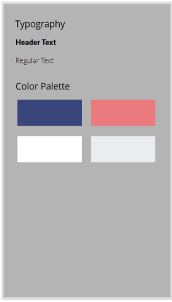
Typography
- Header text
- egular text
Color Palette
- PrimaryColor
- SecondaryColor
- LightColor
- DarkColor
// BRANDING

Set(XamApp, {

    Branding: {

        ColorPalette: {

            PrimaryColor: PrimaryColor.Fill,

            SecondaryColor: SecondaryColor.Fill,

            LightColor: LightColor.Fill,

            DarkColor: DarkColor.Fill

        },

        Typography: {

            HeaderText: HeaderText.Font,

            RegularText: RegularText.Font

        }

    }

});
To use our branding variables, please refer to the image below as an example.

Here, we used the XamApp.Branding.Typography.HeaderText and assigned it to the HeaderFont custom property of our HomeHeader component.
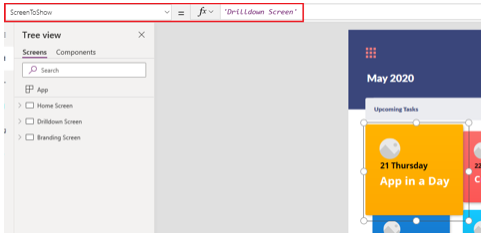
For our Tile components, we assign the ‘Drilldown Screen’ to the ScreenToShow custom property. This is used to navigate to the Drilldown Screen when we click the tiles.
After arranging our components on their respective screens and passing values to their custom properties, here’s our end result.
Home Screen
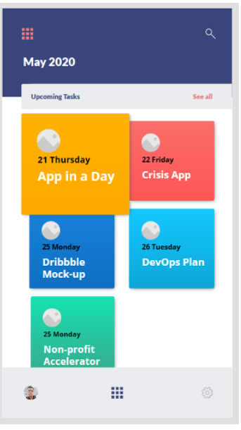
Drilldown Screen

We needed to make some adjustments to the original Dribbble design as the screen used for that design does not have the same form factor as the screen that we used in our Power Apps mock-up. But at this point, it’s just a matter of tweaking if we want to be pixel perfect with our mock-up.
Conclusion
Power Apps have some out of the box features that lets you have a beautiful UI. If that is not enough, we haven’t even touched the surface yet on Power Apps Component Framework (PCF). With PCF, it opens up a whole new world of possibilities to further enhance the UI/UX of an app. We have seen how powerful HtmlText can be, now imagine being able to use HTML, CSS, and JavaScript.